The Do's & Don'ts of Home Decorating- Useful Tips & A Guide To Follow While Designing!
Decorating your home can be a daunting process. Although it can be very confusing in the beginning, I would suggest you take your time. Visualize your home first, rushing things to just complete the look is never a good idea. Your space tends to lack personality when hurried & can seem over cluttered over the years as you collect more things.
When I decorated our home- I decorated straight from my heart. Now how did I do this? In all honesty, I cleared my mind from design clutter. I started off by exploring the market for textiles, textures, stone finishes, cabinetry colors, furniture, wood/wall finishes, lighting & flooring options. After narrowing down textures I wanted to use, I got down to curating our mood-boards. So start somewhere, it can even be with the sofa you want/like & then go ahead with integrating that element into & around your design.
I couldn’t think of a better post to collaborate with some of my favorite interior experts. In this post, I have collated decorating tips to create a cohesive home. Read on, even though style is subjective there are a few rules in design that we should not try steering away from. Everyone makes mistakes and we learn from them. We all have advice on Don’t’s in design as we’ve designed a few spaces & we know with experience that somethings just don't work!
DO’s:
INVEST IN CLASSIC PIECES
Classic pieces stand the test of time as it usually looks as good as it did sometime ago but it’s timeless design tends to break your bank most times. But even though it hurts at first, this piece would definitely go on to become a focal points in that room or your entire house.
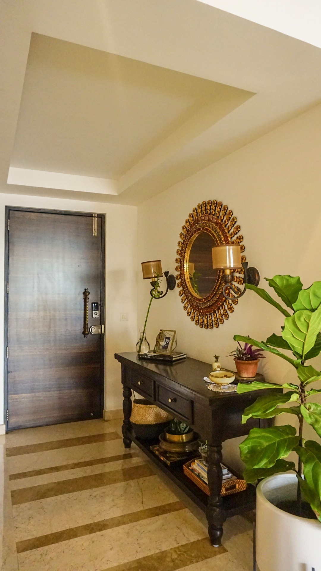
The sunburst mirror gives a classic touch to our entryway, and being hand-painted in glass draws everyone’s eyes to its detailing. Also works as a conversational starter as soon as someone enter’s our home.
MOVE THINGS AROUND IN YOUR HOME OFTEN
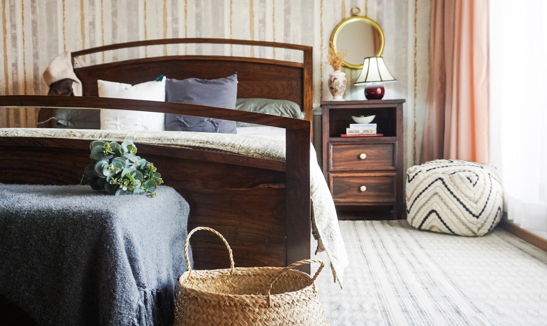
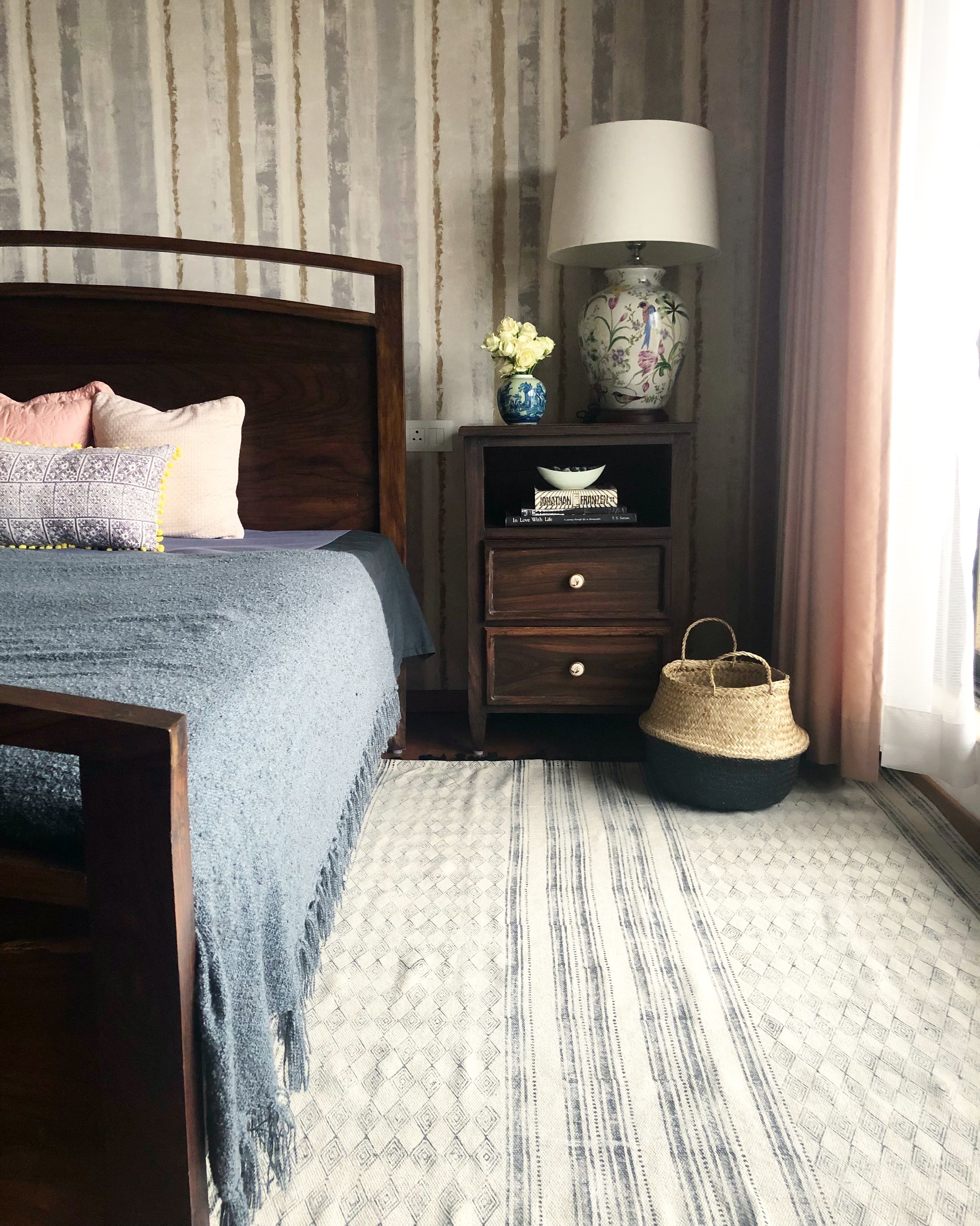
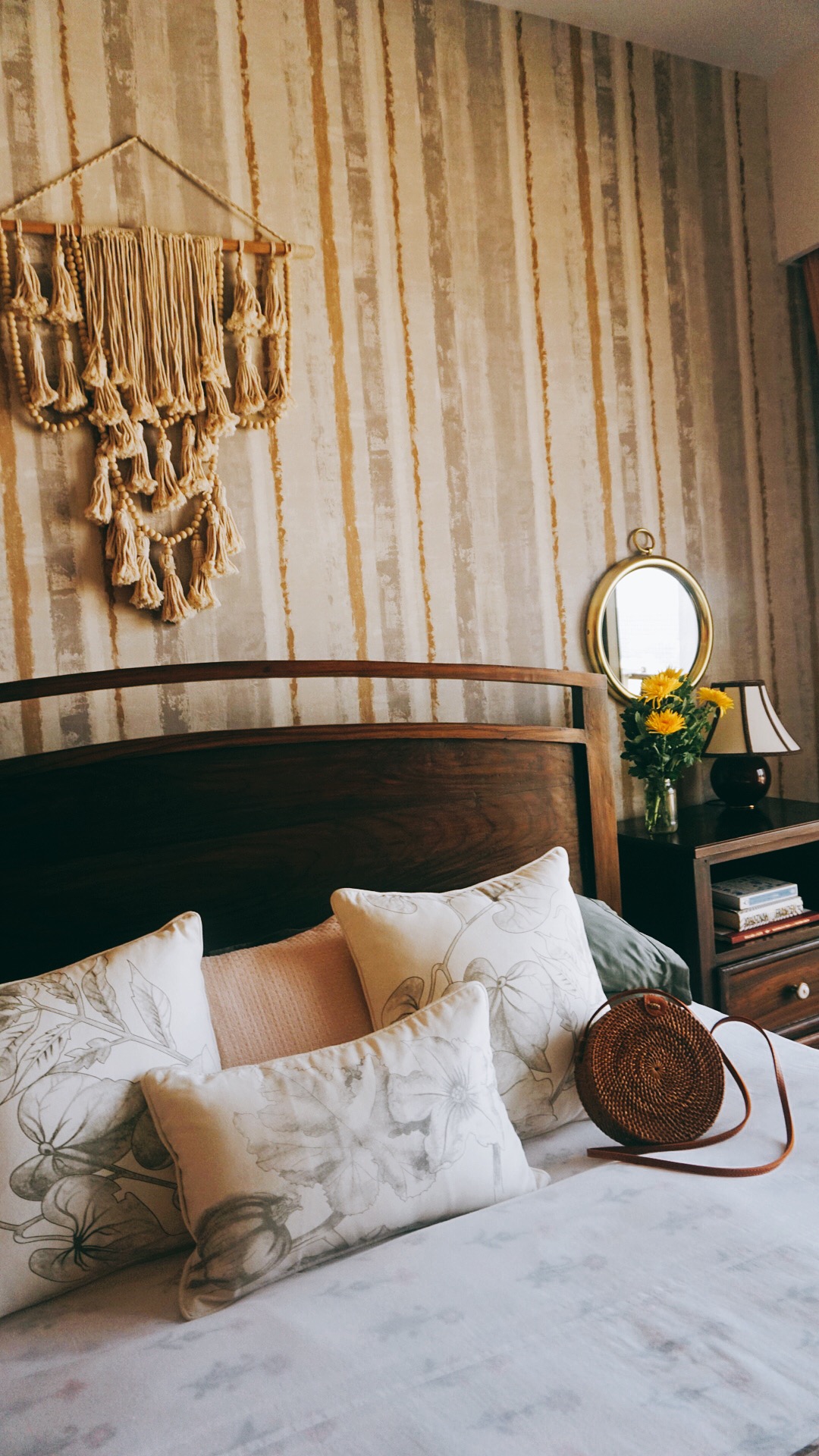
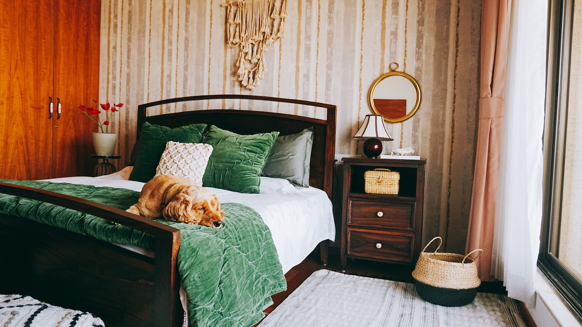
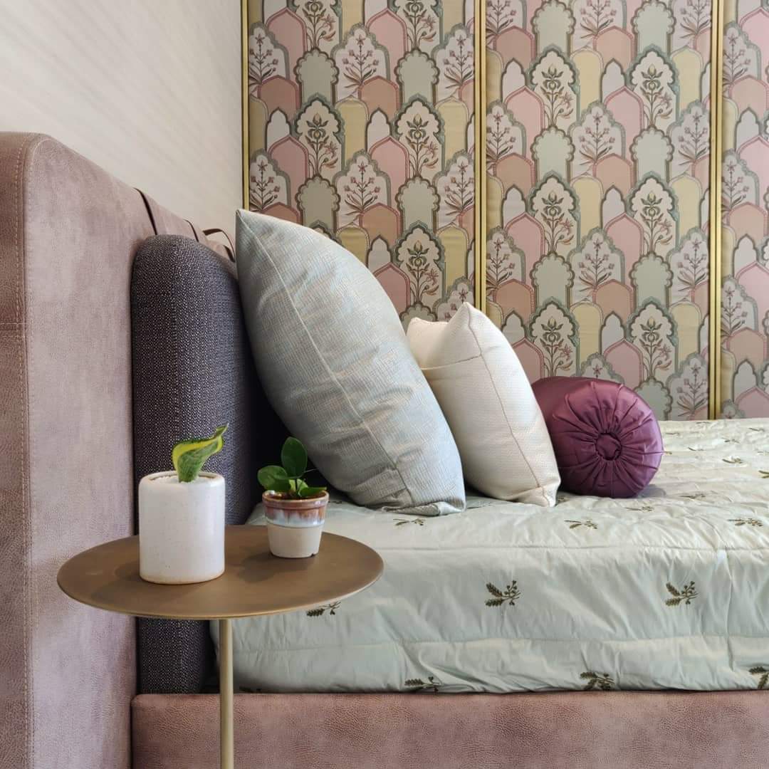
To keep your home looking fresh, move things around in your home. In the pictures below I’ve styled the same bedroom five ways. It’s so fun to rotate pictures, art, mirrors, vases, cushions, throws and bed spreads.
DECLUTTER
I would suggest either giving away or assigning a storage section in your home for extra decor pieces. Keep away and bring them out according to your mood. You don’t need to display everything you have at home!
USE AS MANY NATURAL ORGANIC MATERIAL AS POSSIBLE - NSquareStudio
Stone, wood, jute, rattan and plants; with a special emphasis on the play of natural light in the space. Be mindful and sustainable with purchasing - try to find special pieces made with grounding elements.
Love the clean look of this living room designed by the wonderful ladies- Nikita & Nitisha of NsquareStudio. One of my favorite home decor stores to visit & shop online. So hop on over to their website to shop their products, if you haven’t already!
USE PLANTS- Rittika Ariyona Interior
They are the cheapest and most versatile décor accessories available and will glam up any space like nothing else.
How calming is this entryway?? I definitely feel zen just looking at it! Rittika definitely needs no introduction, she’s a real desi decorista in every sense. Drop by her blog or instagram profile, and keep up with all the design advice she puts out there everyday.
BE BRAVE- Studio Ruh
Let loose and use textures or prints on walls to give them more depth and visual interest. This could be through wallpaper, fabric or textured paint finishes. If you want the look to be more understated and classic opt for plain, textured wallpapers such as fabrics, silks and grass weaves. These subtle options create layering and depth far more effectively than paint. The impact is unbeatable and often at a surprisingly affordable price.
Kavya Sheth transforms spaces so effortlessly, head over to her website or Instagram profile to keep up with her current projects that are so inspo-worthy!
KEEP IN MIND SCALE AND PROPORTION- Weespaces
A large bulky sofa in a small space, an A4 size artwork on a large wall or a 3x5 rug in a living room are all going to look out of place! The key reason is scale.
Your furniture, art and all other items in a room have to be in line with the scale of your room for it to look good! Similarly the proportion of the each of these elements together is also crucial. Scale and proportion is what creates the right balance in a space.
Vinithra Amarnathan’s work is inspiring as she has a keen eye for design. Every project she completes she makes sure to style it impeccably as well, head to her blog as well for more.
DON’Ts:
MATCHING SETS OF FURNITURE & TEXTILES
Gone are the days where everything has to match, from the living room sofas to the centre table & side tables. Most people also try and match fabrics and upholstery thinking that it’s the only way its going to work. On the contrary, your room lacks character and can come across as boring. This trend is definitely outdated, go for an eclectic look!
SKIMPING ON CURTAIN FABRIC
A common mistake I see in most homes is the lengths of curtains, skimping on a few yards of fabric visually cuts the height of your space. Even if your window is small, make sure you don’t stop your curtain at the level your window ends instead take it down to the floor. I would also suggest taking it above the top of the window level, and almost up to the ceiling if possible. Remember again not to skimp on fabric width wise too! Make sure the fabric you chose gathers well so it creates a good effect.
PLACING FURNITURE AGAINST THE WALL
Placing all your furniture up against the wall isn’t the right way to do it, also called the wall hugging disease. Pull your sofa at-least 12” away from the walls. This gives a more airy feel and makes your room feel bigger as well.
AVOID CLUTTER
Clutter your space with too much furniture, colour or simply products that are the trend du jour. This one is a big no-no. Most clients feel the more the objects they bring into a space the cozier the space becomes. On the contrary, empty pockets actually help accentuate design more. Your eyes are immediately drawn to certain elements of a room over others. Don't feel like you to need to furnish or decorate every square inch of your home.
Following one design style throughout the space is also a no, mixing up decor styles makes a space more interesting and layered. (Tip from the ladies at Nsquarestudio & Studio Roh)
IMPULSE PURCHASE
DON’T but things on an impulse. Step back from what you’ve seen even if it’s for 15 minutes. Take a short walk and come back to it. Those few minutes give you time to process where you will use it, whether it gels in with the rest of your décor and whether you like it because it is truly ‘you’ or because it’s the latest décor trend you’ve seen in every magazine. (Tip from Rittika Ariyona)
IGNORE THE ARCHITECTURAL DETAILS
A home that’s not harmonious with the environment and the goes against the architecture of the build always stands out sorely! Walking into a very traditional space housed in a modern loft building or a starkly modern space in a traditional style home feels odd and visually confusing! Its important to retain the character of your building and work with the details when you’re designing your home! (Tip from Vinithra Amarnathan)
I hope some of these decorating tips are useful when you do set up your home. Happy styling!!

