The Kew Home
Warm, evocative, and suffused with character — these expressions conjure a vivid image of The Kew Home, belonging to a nuclear family in Yemlur, an up-and-coming residential neighbourhood in Bangalore. This home is an extension of the aspirations the young couple harboured while envisioning their quintessential first abode for them and their three-year-old daughter.
The homeowners desired a residence that was inspired by classic cottage-style homes often situated in the quaint countryside; a farmhouse aesthetic that was meshed in with modern sensibilities. With the brief helmed by a rustic yet neoteric persona, the abode was christened ‘The Kew Home’. Paying homage to the design nuances of that of a picturesque cottage that could be found in a quiet British borough; a dwelling that could be easily tucked away in the royal estate of Kew, steeped in old-world charm paired with a lived-in sentiment.
Typology and Square Footage – 3-BHK Family Apartment, 1,605 Square Feet
Text Credit – Lavanya Chopra
Photography Credit – Nayan Soni
With site-level progress fractionated across ten months amidst the lockdowns of the second wave, the home was handed over while grappling with unprecedented challenges of the Pandemic. The residence had to pose as a pragmatic space which could echo their lifestyle practices, sustain the couple’s remote working regimens while also posing as a flexible sanctuary for their toddler to explore and grow into. The introduction of light, multifunctional and portable furniture became essential while piecing together the scheme of spaces.
The home’s original layout was subject to transformation in the form of small scale, yet impactful iterations. The challenge at hand was to create a cohesive spatial flow between the living, dining, and kitchen spaces. To address the same, the partition wall of the kitchen was demolished to make way for a breakfast counter, a manoeuvre that instantly opened the blueprint! The door placement of the daughter’s bedroom too was shifted in position to make adept usage of the nook in the dining area to incorporate additional storage. These changes in segments of the interior layout led to a shift in the flow of the communal spaces, which was pivotal in this compact urban residence’s floor plan.
The guiding inspiration for this abode stems from wanting to create a tranquil environment, one that is expressed through design and its myriad facets. The Kew Home witnesses the conjunction of a neutral hue and material palette with accents of colour and textures that manifest as furnishings, bric-a-brac and curated art. While walking through the apartment during the preliminary stages and gauging the extent of its square footage, we were strongly leaning towards the idea of going big, bold and dramatic! Our intervention was to engage the colour black as a leitmotif skilfully, creating statement vignettes. Dark colours are often shied away from in smaller volumes, we were lucky the clients believed in our vision of playing on the front foot when it came to unconventional colour utilization.
The foyer is a bijou spot but layered with character nonetheless! The ceiling has been sheathed with a grid of rafters in a deep umber tone, creating a bespoke design element. A colossal antique wood-framed jharokha mirror occupies one of the walls of the vestibule, nodding to the traditional undertones the home shelters. The sleek wall-mounted shoe storage unit creates an ingeniously concealed space for the functional needs of the passageway, while an illustrated world map print frames the nook. A banana fibre pendant crowns the foyer, shedding a diaphanous light into the space.
One is led into the open-plan and light-washed nucleus of the home composed of the living room, prayer niche, dining area, and kitchen — a conglomerate of spaces that anchor the communal activities of the home. A pastel haven, the living area hosts a concoction of warm and cool tonal play. The focal wall has been cladded in lava stone, creating sinuous forms that are reminiscent of cozy country homes in its usage of earthy materiality. The deep veneer-wrapped console beneath the television culminates as a lofty wood and metal bookshelf, which poses as a visual divider between zones while tying in with the living space.
The channel-tufted blush pink sofa, the custom Aanai Design Studio deep navy armchair and the ochre upholstered wood bench ground the seating space, dabbling in a playful yet restrained collage of soft hues. The cluster of teal tray coffee tables by Freedom Tree, the sculpted wood by Mirador, and the planters by Studio Palasa, each adds to the fabric of the living space, marrying functionality and visual aesthetic. The handmade patterned rug by The Rug Republic defines the space immaculately, complementing the plush embroidered curtain which has been paired with linen sheers.
A petit prayer niche finds its rightful place within the expanse of the living room, positioned almost as an extension of the foyer. The unit is bound between two symmetric partition members created in a teak finish (matched to the foyer) with an array of rectilinear fluted glass infills. This dedicated prayer space allows the lady of the home to be seated while praying. The detail which places the prayer niche at a step-level higher is to ensure that inhabitants of the home don’t walk past the deity with shoes on.
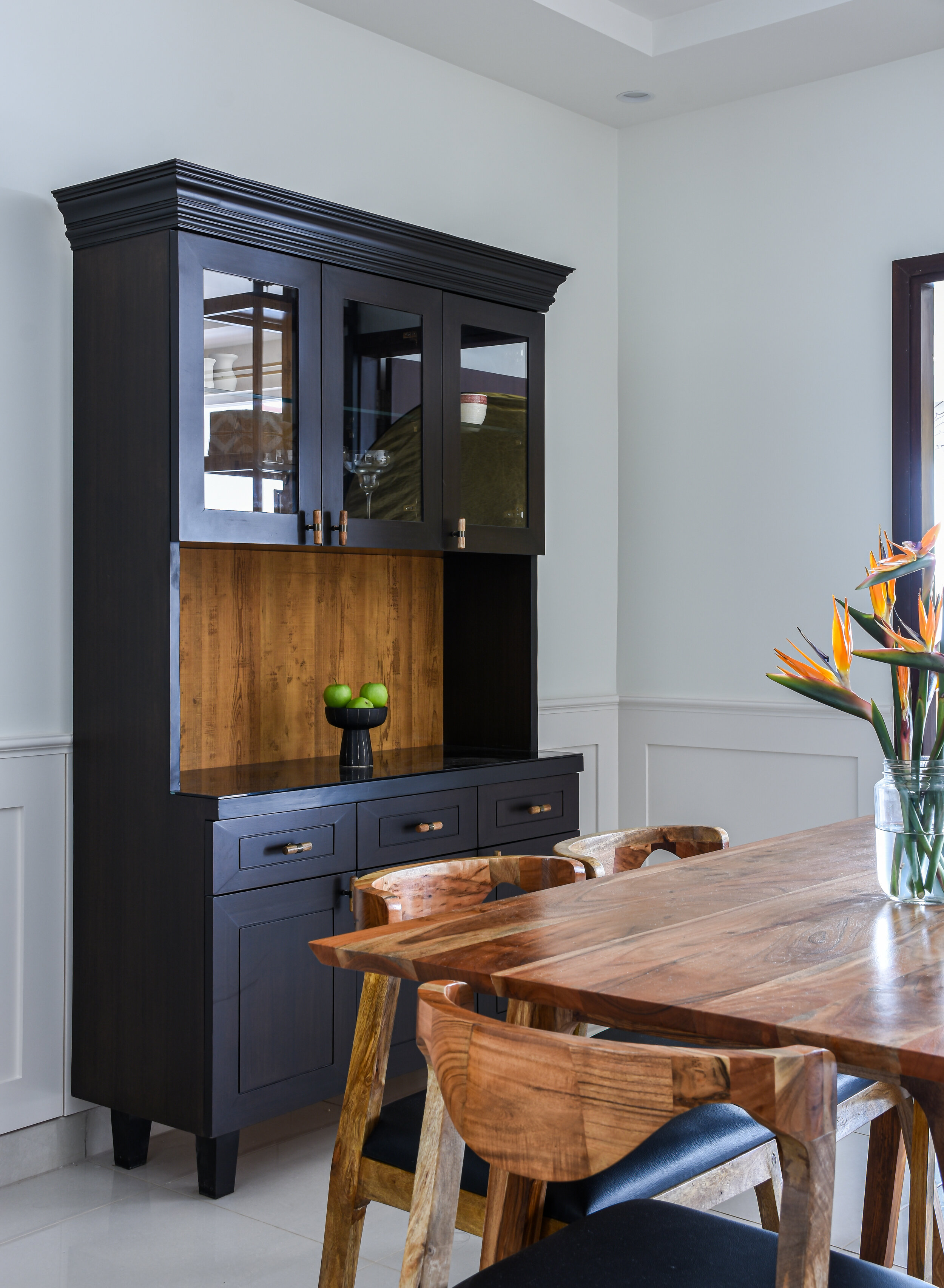
The dining area is immersed in a play of monochrome, creating a suave space that has been peppered with accents of wood and brass. The wainscoting enveloping the perimeter of the dining space affirms the English cottage demeanour that becomes the overarching theme in The Kew Home. A six-seater acacia wood dining table with mid-century modern chairs upholstered in black fabric rests perpendicularly to the open kitchen. This space allows loved ones to convene and interact with the lady of the home as she indulges in preparing sumptuous meals while hosting. The three-headed brushed brass chandelier by The Purple Turtles presides over the dining area, elevating the palette with its muted lustre. The crockery cum bar hutch unit is the true jewel here, it restates the prevalence of the modern farmhouse narrative of the home. Its body swathed in deep-stained veneer enlivens the inclusion of the exaggerated grain laminate as its backing, creating a welcome contrast of materials.
The kitchen’s presence has been melded into the overall spatial flow intrinsically post the removal of the former partition wall. Doused in an interplay of black, white, and light wood veneer, the kitchen is a dapper universe in its own right. White quartz over the countertops ascends to bathe the backsplash surfaces. The matte black PU finish over the laminate membrane units creates a robust visual focus upon the colour’s ubiquitous yet intentional usage. The lighter wood finishes across the under-counter units create a subdued palette in unison with the monochromes.
The kitchen sink has been confined to the adjoining utility area, to create maximized counter space. Despite its small scale, the designed kitchen provisions for effective corner-access storage, an oven-microwave combination niche, and a capacious pull-out pantry unit. A peninsula breakfast counter earmarks the transition into the kitchen where the former partition wall once stood, creating an additional surface for seating and storage; a lone amber glass pendant has been mounted over the breakfast counter, piecing together an inviting corner during mealtimes.
The private bedrooms in The Kew Home are replete with comfort, optimized function and visually epitomize the employment of pared-down colour palettes and tangible materiality. Airy, bright, and straight out the pages of modern-English quarters, the master suite is an oasis for the couple which plays on symmetry to create the design montage. The focal wall is adorned with a successive row of vertical panelling in a light buff shade, imbuing the space with an additional sense of dimension and visual height. A beechwood bed and a set of nightstands with brass detailing assume centerstage while the room is saturated in shades of white. Colour makes a cameo in the form of select furnishings like the tropical-themed Nicobar cushion covers.
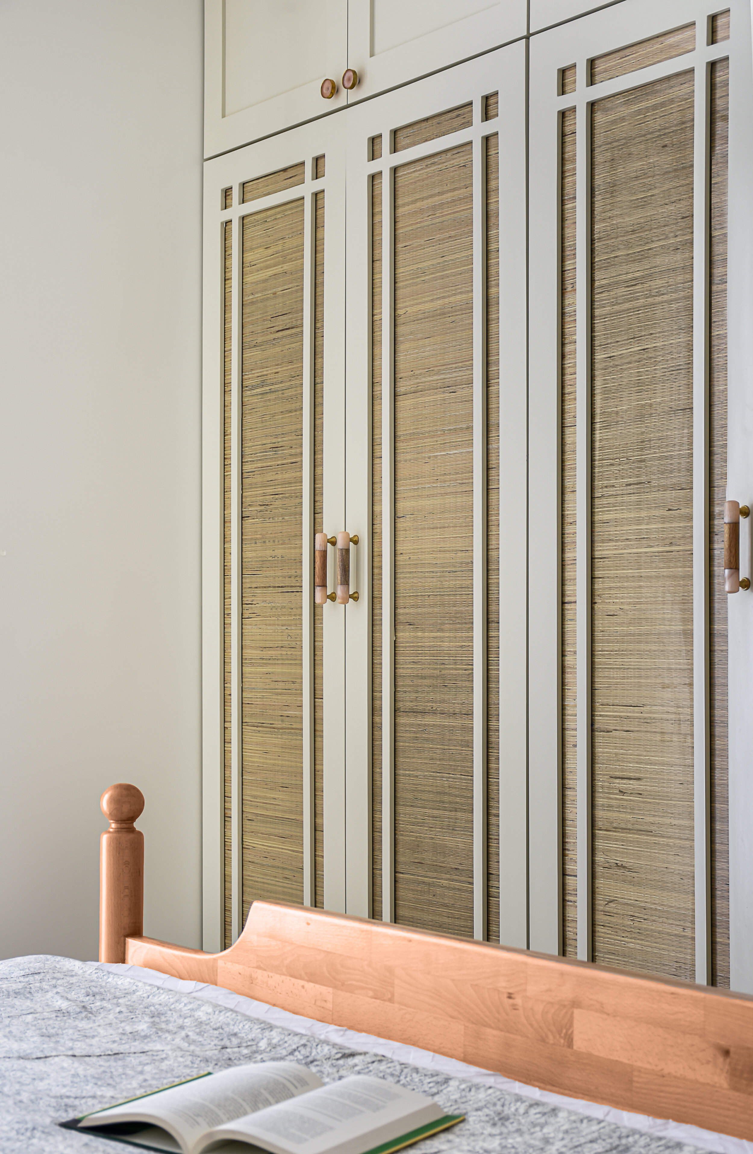
Custom mirrors from Top Brass and cement-finish and brass pendants by The Purple Turtles embellish the nightstands, introducing stated elegance to the master suite. The fabric choices in the space remain grounded with the layered solid and sheer curtains, as well as the taupe and black geometric shag rug. The wardrobes bear an artisanal quality kudos to the shutters in a warm white PU finish that hold jute-sandwiched glass infills which tie the space together in a copacetic fashion. The master bedroom embraces the couple’s every need while weaving together a milieu that rings true to the overruling design intent.
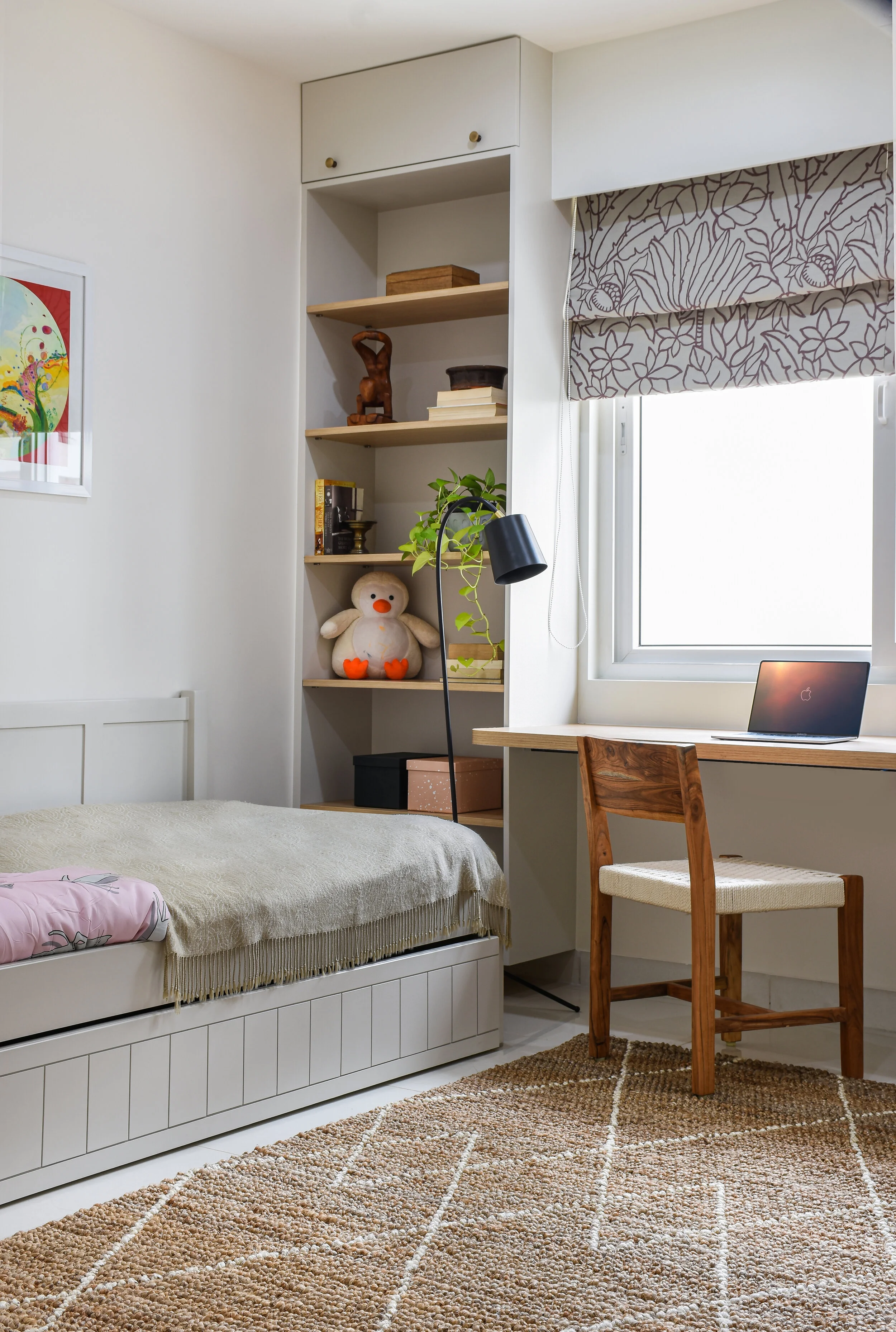
The daughter’s bedroom brews a love affair with the colour peach and pastel shades within its walls. Keeping in mind her morphing age and related needs, the bedroom was conceptualised to ensure there was ample free floor space coupled with a jute rug for her to play while furnishing the room with ample storage. This bedroom also doubles up as a study for the clients, wherein the cantilevered wooden ledge has been fashioned like a work desk. A rope study chair ideal for the young daughter and the ebony floor lamp by Freedom Tree complete the study nook.
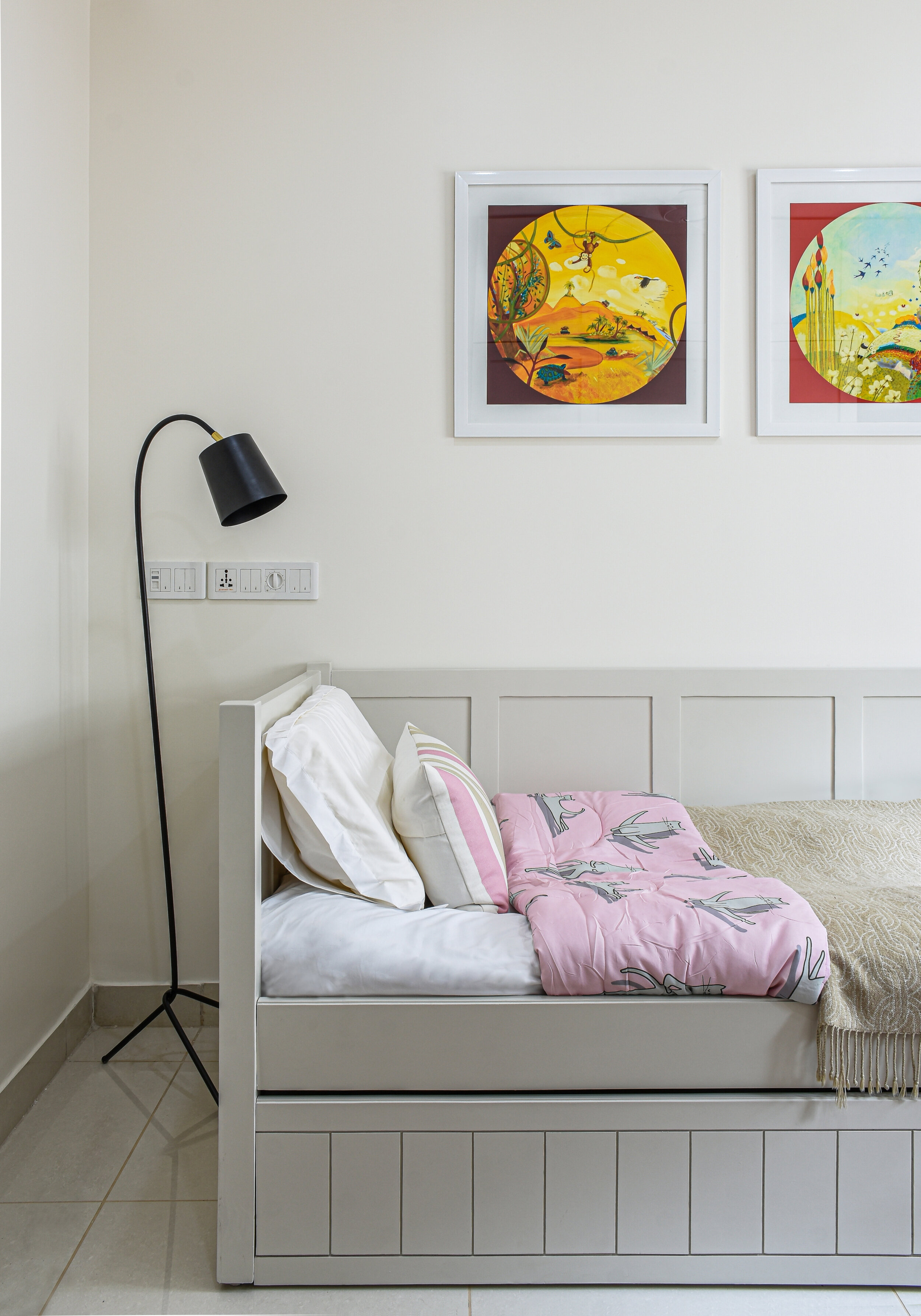
A combination of open and closed storage niches holds baskets and boxes for the toddler’s toys and curios. The pale pink and off-white tropical-inspired blinds by VAYA Home intersperse the colours in the room. The custom trundle bed makes for a versatile and space-saving piece of furniture, allowing the room to respond to the various needs of the youngest end-user. A duo of fantastical vibrant art prints by Calcuttan Gallery breathes colour into the resting space. The wall-length wardrobes are finished in a soft peachy tint and are detailed to perfection with jute-wrapped handles that add a sense of tactility to the palette.
The guest bedroom is a melange of neutral greys and doses of yellow. The way daylight streams into the room sculpting the room’s aura. This bedroom strikes the perfect equilibrium between function and a tasteful narrative.
A preowned king-sized bed of the clients was repurposed into a queen-sized one, and the former bed was rendered in a homogenous shade to match other wood tones in the room. A neutral grey wardrobe lines the wall and is punctuated with a niche for the television. This wardrobe extends out as a window seat which occupies the wall under the fenestrations, creating a tactful seating and storage amenity lined with woven wicker drawer fronts. The printed Ikat yellow and grey motif fabric blinds layer the windows, building on the colour scheme in this serene guest bedroom.
The Kew Home has been designed with a penchant for detail, crafting an experiential abode that etches the family’s needs into being. Our clients were equal collaborators in the process and placed their utmost trust in the design instincts we nurtured for this home. Transportive in nature, The Kew Home has propelled its inhabitants to dream uninhibitedly when it came to defining what their idyllic home would present itself as — a dwelling that revels in the country cottage spirit!


